Thursday, August 20, 2009

Night Club Poster 3

The Loft

Typography
This poster uses a display font that resembles a neon sign. All of the body font uses a plain sans serif typeface.

Illustration
The background of the poster is pink viny, tribal design with a jagged eroded white design on the right side.

Colour
The poster only uses white, yellow and shades of pink. The poster is predominantly pink with yellow and white font

Balance
The poster is ell balanced, all of the text is left aligned on the left side of the page and there is some decoration on the right side of the page.

Culture
The poster is aimed at a young adult culture, it is bright it has a tribal feel in the background and a jagged eroded design at the front, combined with a clean crisp typeface.

Nightclub Poster 2

Clique

Typography
This poster uses a very blocky sans serif font throughout most of the poster. All of the headings and important parts of information have been made bigger so they will stand out more.

Illustration
The poster has a big illustration of a muscle car as its focal point. Most of the posters content is contained in blue shapes that have a splattered and faded texture to it. The poster also has an old 70’s looking pattern bordering some of the page.

Photography
The only photography used was photographs of two of the performers appearing at the club. The photographs are black and white and quite small so they wont stand out too much

Concept
This poster uses a retro concept. The poster looks like it is worn, torn and faded. It also looks like it is a picture of a poster on an old bench or wall

Colour
The poster mainly uses black, white and shades of blue. It also has some yellows and oranges used very minimally around the border

Balance
The poster is fairly balanced the image and headings are centred and all of the information is in evenly spaced columns at the bottom of the page.

Culture
This poster fits in to a very street culture, with the gritty faded imagery almost looking like it could be graffiti.

Night Club Poster 1

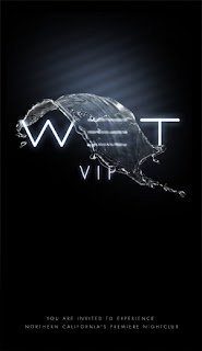
Wet

Typography
The type used is very basic and plain. The type for the heading stands out because it is a large, bright, glowing white font on a black background.

Photography
There is a photograph, of a wave of water in the air. The water looks as if it is flowing over the title.

Concept
The poster uses a minimalist concept by only having a small amount of elements on the page and using a lot of black negative space. It uses water and liquid as a concept, the name of the club is wet and it uses water as its only image.

Colour
The poster uses mainly black and white, however the image and the glowing text have a slight blue ting to them.

Balance
The poster is really balanced. All of the text is centre aligned. The image flows over the centre of the type.

Culture
This poster speaks to a very upper class target audience. The poster is aimed a very classy culture

Monday, August 10, 2009

Final composits

Me Myself & I


The Grass is always Greener on the other side


Underwater

me myself & i Composit


I took several photos of my self all in the same room so the lighting would be right in all of the photos. For the base photo i sat at a table with on hand flat and another about to squash something.
I then took several photos in different positions then i shrank them a placed them around me and the table.

Monday, August 3, 2009

Grass is Greener

The Grass is Always Greener on the Other Side

I decided to do a person dreaming of an expencive car when thay already have a car and bills to pay.

I used an image of a 61 ' Farrari GTO 250, a girl from SXC, a front yard, two cars, a photo of some clouds, a letterbox, and a pile of letters.

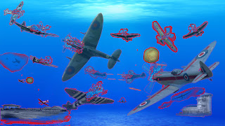
Composit: Underwater


Under Water Scene

I decided to do dog fight using old spitfire airplanes underwater.

In the scene I am using allot of old planes from SXC and various website, some explosions, some bullets taken from stills of The Matrix", an airfield and a communications tower.