Thursday, November 12, 2009

childrens picture book


Character: Winston

Father of the main character. this character was originally conceived as a butler

childrens picture book


Character: Cyndi


Mother of main character, originally this character was going to be a love inerest for the hero

childrens picture book


Character: Doug


the older brother. originally this charater was going to be a sidekick for the hero

childrens picture book


Character: Dr. Shocking


The Main villian for the book

childrens picture book


Character: Captain Awesome
the main hero for the story.

Thursday, November 5, 2009

Final Book

Page 1
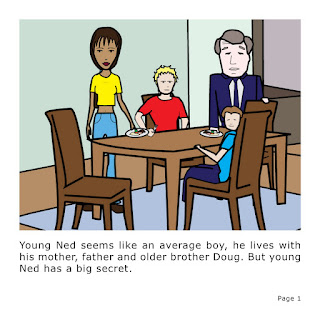
an opening page showing all the family at the dinning room table


Page 2
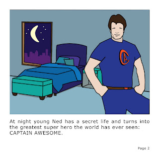
an indoor shot at night showing captain awesome in young neds bed room


Page 3
a close up of dr shocking escaping while captain awesome fights some henchmen


Page 4
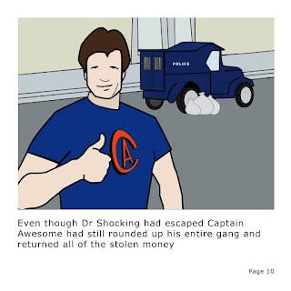
captain awesome giving a thumbs up with robbers in a cop car and the stolen loot next to it

childrens picture book

Children’s Book

The Fantabulous Adventures of Captain Awesome

Characters

Ned – The young boy
Captain Awesome – The hero
Dr Shocking – The villain
Doug – The older brother
Cyndi – The mother
Winston – The father


Synopsis

A young boy can turn in to a super hero at night


Story

P1. Young Ned seems like an average boy, he lives with his mother, father and older brother Doug. But young Ned has a big secret.


P2. At night young Ned has a secret life and turns into the greatest super hero the world has ever seen: CATAIN AWESOME.


P3. One day during dinner young Ned saw some of the evening news. He found out that someone had robbed the city bank. He knew he would have to change into Captain Awesome and find the bank robbers.


P4. After dinner young Ned went to bed and waited for his parents to fall asleep then changed into Captain Awesome and leaped out the window and headed for the bank.


P5. As Captain Awesome arrived at the bank he searched the bank for clues. He found a tunnel in the vault, where the buglers entered the bank.


P6. Captain Awesome followed the trail of gold coins all the way to the lair of the evil Dr. Shocking.


P7. “I should have know it was you who robbed the bank Doc Shock” said Captain Awesome.

“You wont get me this time Captain Flawsome“ yelled Dr Shocking as he told his guards to get Captain Awesome.

P8. Captain Awesome easily fought of all of the Shock gang, but while he was fighting Dr. Shocking had disappeared.


P9. While Captain Awesome was fighting the guards the cowardly Dr. Shocking escaped using a secret underground tunnel.


P10. Even though Dr Shocking had escaped Captain Awesome had still rounded up his entire gang and returned all of the stolen money

Monday, September 28, 2009

cover soundtrack


to seperate this from the games i made the image black and white moved it to the right and put a thick white border around the edge of the cover


i put both screenshots in the large "OST" (original sound track) on the back too see wich one i liked best


cover


i blured some of the edges of the image so it wouldent look so vector for the playstation 3

wii cover


compleated wii cover

wii cover design


a vector image of the main character in a straight jacket. i will use this image for the frontcover of the game.

wii game screen shot 2


the second screen shot for the back cover. this one is a close up of the main characters face while he is holding an axe.

Monday, September 14, 2009

wii game screen shot


the first screen shot for the back cover

wii game


I have some ideas down on paper but nothing definitive yet, so i have created all of the legal and technical stuff first on the game and soundtrack covers, while i still work on the imagery


wii game


I came up with a few different ideas for wii games, i ended up going with a game where the main purpose is to escape an insane asylum. After coming up with severeal ideas for a title I decided to go with "brain damage".

Thursday, August 20, 2009

Night Club Poster 3

The Loft

Typography
This poster uses a display font that resembles a neon sign. All of the body font uses a plain sans serif typeface.

Illustration
The background of the poster is pink viny, tribal design with a jagged eroded white design on the right side.

Colour
The poster only uses white, yellow and shades of pink. The poster is predominantly pink with yellow and white font

Balance
The poster is ell balanced, all of the text is left aligned on the left side of the page and there is some decoration on the right side of the page.

Culture
The poster is aimed at a young adult culture, it is bright it has a tribal feel in the background and a jagged eroded design at the front, combined with a clean crisp typeface.

Nightclub Poster 2

Clique

Typography
This poster uses a very blocky sans serif font throughout most of the poster. All of the headings and important parts of information have been made bigger so they will stand out more.

Illustration
The poster has a big illustration of a muscle car as its focal point. Most of the posters content is contained in blue shapes that have a splattered and faded texture to it. The poster also has an old 70’s looking pattern bordering some of the page.

Photography
The only photography used was photographs of two of the performers appearing at the club. The photographs are black and white and quite small so they wont stand out too much

Concept
This poster uses a retro concept. The poster looks like it is worn, torn and faded. It also looks like it is a picture of a poster on an old bench or wall

Colour
The poster mainly uses black, white and shades of blue. It also has some yellows and oranges used very minimally around the border

Balance
The poster is fairly balanced the image and headings are centred and all of the information is in evenly spaced columns at the bottom of the page.

Culture
This poster fits in to a very street culture, with the gritty faded imagery almost looking like it could be graffiti.

Night Club Poster 1

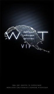
Wet

Typography
The type used is very basic and plain. The type for the heading stands out because it is a large, bright, glowing white font on a black background.

Photography
There is a photograph, of a wave of water in the air. The water looks as if it is flowing over the title.

Concept
The poster uses a minimalist concept by only having a small amount of elements on the page and using a lot of black negative space. It uses water and liquid as a concept, the name of the club is wet and it uses water as its only image.

Colour
The poster uses mainly black and white, however the image and the glowing text have a slight blue ting to them.

Balance
The poster is really balanced. All of the text is centre aligned. The image flows over the centre of the type.

Culture
This poster speaks to a very upper class target audience. The poster is aimed a very classy culture

Monday, August 10, 2009

Final composits

Me Myself & I


The Grass is always Greener on the other side


Underwater

me myself & i Composit


I took several photos of my self all in the same room so the lighting would be right in all of the photos. For the base photo i sat at a table with on hand flat and another about to squash something.
I then took several photos in different positions then i shrank them a placed them around me and the table.

Monday, August 3, 2009

Grass is Greener

The Grass is Always Greener on the Other Side

I decided to do a person dreaming of an expencive car when thay already have a car and bills to pay.

I used an image of a 61 ' Farrari GTO 250, a girl from SXC, a front yard, two cars, a photo of some clouds, a letterbox, and a pile of letters.

Composit: Underwater


Under Water Scene

I decided to do dog fight using old spitfire airplanes underwater.

In the scene I am using allot of old planes from SXC and various website, some explosions, some bullets taken from stills of The Matrix", an airfield and a communications tower.

Monday, May 18, 2009

GPS

4th POST

I constructed the analogue box out of cardboard. i used a fineliner for all of the text and the barcode and coloured pencil for the gimmick. on the box i have put on screen information, whats in the box, warranty, technical info, barcode, gimmick.

I got some clear plastic to make a window in the top of the box so the buyer can directly see the actual product.


After making the analogue box i recreated it in illustrator and printed it out so i could make a profesional lookin digitally made box.

Monday, May 11, 2009

GPS

3rd POST

I'v started to digitaly create the gps box. i made it in 3 different colours, black, dark blue and orange and i asked the class which they like best. some liked orange some liked dark blue.

i also put in all the techinical infomation and features i found for a gps navigator on the internet

Friday, May 8, 2009

GPS

2nd POST
After choosing a name, model number and logo i started doing some sketches for the design of the GPS box


After some designs i decided to do a box with clear plastic on it so the buyer can see the device, the top of the box was going to have the Logo and model number. all the information, specs gimmick and bar code are going to be on the sides of the box

GPS

1st POST

So far i have done some research on GPS navigators, on the internet and in stores to get a general idea of how to design the packaging.

I have come up with several names, model numbers and logos.

I have designed some logos targeted at different audiences, ones for technical type of person, ones for truckies and rough workers, ones for a female user and some are just open for a wide target audience.

Monday, March 2, 2009

Colour Psychology part3

Brown
Brown represents effectiveness, strength, reliability warmth, comfort, security, politeness, richness, and helpfulness. Brown usually represents earth and natural things. Brown can also create feelings of sadness and isolation brown can also be conventional and sophisticated.

Grey

Gray is the color of independence and self-reliance, gray represents separation, lack of involvement and ultimately loneliness. Grey is associated with old age, death, taxes, depression or a lost sense of direction.

Silver

Silver represents prestige and cleanness. Silver can also come off as cold and scientific. Silver is balancing, harmonizing and sensitive.

Colour Psychology part2

Pink
Pink is a tranquilizing colour that symbolizes innocence and child-like flirtatiousness. Pink is usually associated with Spring, gratitude, appreciation, admiration, sympathy, homosexuality, kittens, femininity, health, love, sex, marriage, joy. Pink is used mainly in products for children and babies.

Blue
Blue can create feelings of calmness or serenity but if it is over used it can create feelings of sadness. Blue represents things that are peaceful, tranquil, secure, loyal, trust worthy and orderly

Black
Black reflects authority and power, it is also associated with unhappiness, formality, and sophistication.

White
White reflects purity, cleanliness, sterility,youthfulness, mildness and neutrality.White can create feelings of peace and comfort.

Gold
Gold is associated with value it suggests expensive, and prestige.

Wednesday, February 25, 2009

Colour Psychology part1


Red
Red is an emotionally intense color. Red is
associated with love, danger, desire, speed, strength, violence, anger, stop signs and blood. Red also attracts a lot attention.


Orange

Orange invokes feelings of balance excitement
enthusiasm, vibrancy, and warmth. Orange is a very energetic colour that is very attention getting. orange can symbolize autumn leaves, pumpkins and Halloween

Yellow
Yellow is cheerful sunny and is an attention getter. It is the most difficult color for the eye to take in, so it can be overpowering if overused. Yellow enhances concentration and it also speeds up metabolism.


Purple

Purple represents royalty, spirituality, nobility, ceremony, mystery, transformation, wisdom, enlightenment, cruelty, arrogance, mourning. Purple is considered an exotic colour.


Green
Green represents nature, environment, health, good luck, renewal, youth, vigor, spring, generosity, fertility, jealousy, inexperience, envy, and misfortune. Green soothes, calms, and has great healing powers(hospitals).


Sunday, February 22, 2009

Word Art


two images of james bond from the 'casino royale' cover using text from the opening theme song